A Guide to Visual Stress and Coloured Overlays
This phenomenon is known as Visual Stress (sometimes referred to as Meares-Irlen Syndrome). It is a perceptual processing issue that can make reading an exhausting and painful chore. Fortunately, a simple yet scientifically backed tool—the coloured overlay—is helping thousands of readers regain clarity and confidence.
What is Visual Stress? (It’s Not Just About Vision)
It is a common misconception that all reading difficulties stem from a need for traditional glasses. Visual Stress is not an issue with the physical health of the eye or a refractive error like near-sightedness. Instead, it is a neurological issue related to how the brain processes visual information.
When someone with Visual Stress looks at high-contrast text (black ink on bright white paper), the visual cortex in the brain can become over-stimulated. This over-stimulation leads to “visual distortions.”
Common Symptoms of Visual Stress
- Movement of Text: Words or individual letters may appear to vibrate, wobble, blur, or even flip upside down.
- Patterns and Glare: The white spaces between lines can seem to “bleed” into the text, creating patterns described as “rivers” or “waterfalls.”
- Physical Discomfort: Rapid fatigue, sore eyes, frequent blinking, or tension headaches after short periods of reading.
- Tracking Issues: Frequently losing your place on the page, skipping lines, or needing to use a finger to keep track of words.
The Science Behind the Colour: How Overlays Work
While research is ongoing, the leading theory suggests that specific wavelengths of light trigger hyper-excitability in the brain’s visual cortex. By placing a coloured overlay—a transparent plastic sheet tinted with a specific hue—over the text, we filter out those problematic wavelengths.
Think of it like a pair of noise-cancelling headphones for your eyes. By “quieting” the visual noise, the brain can focus on the actual shapes of the letters. Because every brain is unique, the “trigger” wavelength varies; what works for one person (e.g., aqua) might make things worse for another. This is why the selection process is so personal.
Identifying the Need: When to Consider Overlays
Coloured overlays are not a “cure” for dyslexia (which is a language-based learning difference), but the two conditions often overlap. If a child is struggling to read, addressing the visual discomfort can be the first step in unlocking their potential.
You should consider exploring overlays if you notice the following:
- Avoidance: A strong aversion to reading despite having the intellectual ability to do so.
- Rubbing Eyes: Frequent eye-rubbing or squinting while looking at a page or screen.
- Glare Sensitivity: Complaining that the page is “too bright” or “hurts to look at.”
- Format Preference: A marked improvement when reading text on beige paper or in a larger font.
Important: Take the First Step with Professional Screening
If you or your child experiences these symptoms, it is essential to determine if the root cause is visual, phonological, or both. The first step should always be a formal dyslexia screening test.
Companies like The Indigo Dyslexia Centre provide comprehensive screenings that can identify whether your struggles are linked to dyslexia, visual stress, or a combination of the two. Identifying the specific nature of your learning profile ensures that you get the right support whether that is a coloured overlay, specialized tutoring, or both.
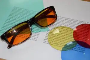
Finding the ‘Right’ Colour: The Selection Process
The “best” colour is entirely individual. Simply grabbing a yellow folder and hoping for the best is rarely effective. To see real results, you need a systematic approach.
1. Initial Screening
A standard testing kit usually contains 9 to 12 different hues (ranging from Mint Green and Aqua to Magenta and Orange).
- The Setup: Use a page of standard, small-print text in a well-lit room.
- The Test: Place each colour over the text one by one.
- The Feedback: Ask the reader, “Does the text stay still now?” or “Is the white background less bright?” Avoid leading questions. Often, when the “right” colour is found, the reader will have an “Aha!” moment where the text suddenly looks “normal” or “calm.”
2. Professional Assessment (The Gold Standard)
For persistent or severe difficulties, a professional assessment with an optometrist specializing in visual stress is highly recommended. They often use an Intuitive Colorimeter.
This device allows the specialist to infinitely adjust the hue, saturation, and brightness of light to find the exact therapeutic tint. This precision is often more effective than a standard plastic overlay and can even be used to create Precision Tinted Lenses (glasses), which provide relief for the entire field of vision, including looking at whiteboards or across a room.
Best Practices for Using Overlays
Once you’ve found your “magic” colour, consistency is key to retraining the visual system.
- Consistent Use: Use the overlay for every reading task—school books, recipes, or office documents.
- Flat Placement: Ensure the overlay lies perfectly flat. A crumpled or scratched sheet can create new visual distortions.
- Lighting Matters: Overlays work by filtering light. Try to use consistent, natural lighting. Many people with visual stress find harsh fluorescent “cool” lighting particularly difficult; a warm desk lamp can often help.
- Keep it Clean: Fingerprints and dust can reduce the transparency of the overlay, making the eyes work harder. Wash them gently with soap and water and pat dry.
Overlays in the Digital Age
In 2026, we do more reading on screens than on paper. Fortunately, the principles of colour filtration have moved into the digital world.
- Screen Tinters: Most operating systems (Windows, macOS, iOS, Android) now have built-in “Accessibility” or “Colour Filter” settings. You can apply a global tint to your entire screen to match your tested overlay colour.
- E-Readers: Devices like Kindles or iPads allow you to change the background from “White” to “Sepia” or “Green.”
- Browser Extensions: There are numerous browser tools that allow you to “tint” the background of any website you visit, removing the harsh white glare of the internet.
A Tool for Confidence and Progress
Coloured overlays do not teach a person how to read—they remove the physical barrier that prevents them from learning. When the text stops moving and the headaches fade, a reader can finally focus on the meaning of the words rather than the struggle of seeing them.
By identifying the symptoms early, seeking a professional screening at a centre like The Indigo Dyslexia Centre, and finding the correct tint, you can transform reading from a source of anxiety into a source of joy.